

Press / and pick Table. You get three columns and three rows with a header
across the top; Tab moves to the next cell and adds a row when you reach the
end.
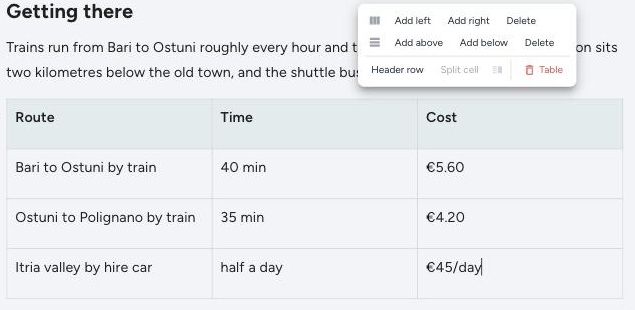
Adding and removing rows and columns
Put the cursor in any cell and open the table controls from the selection bar. You get:
- Columns — add left, add right, delete
- Rows — add above, add below, delete
- Header row on or off
- Merge cells, when more than one cell is selected — and split again
- Table in red, to delete the whole thing
What tables are good for
Anything you would otherwise write as "day one… day two… day three", or a run of prices buried in a sentence. Readers scan a table; they skip a paragraph of numbers.
Three columns is usually the most a phone can show comfortably. If you find yourself at six, the honest answer is usually two tables or a list.
Good uses:
- Costs — what a thing was, what it cost, whether it was worth it
- Opening times — especially where they change by season, which is exactly what a reader is checking
- Getting there — the options, how long each takes, roughly what each costs
- A day-by-day plan — where you slept, what you did, how far you moved
Keep them short
A table is a promise that everything in it matters. If half the rows are there for symmetry, cut them — the ones that are left will actually get read.